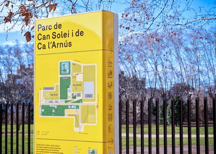
Great Park signage for the Metropolitan Parks of Barcelona by Clase BCN and Salva Fabregas. This iconic yellow system stands out in the green park setting to provide a consistent look for the regions network of urban parks. The design uses a strict formula: “the same material, the same design, the same finish, the same type and the same simple layout” to create a system with an unified modern feel.
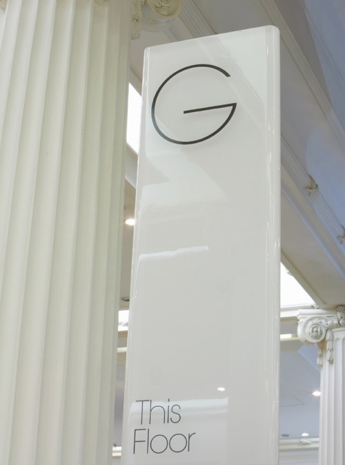
Elegant wayfinding for the British department store Selfridges & Co’s new flagship store by Cartlidge Levene. This sleek white system uses thin silhouettes, rounded corners and gloss finishes to capture the upscale and contemporary feel of this high-end brand.
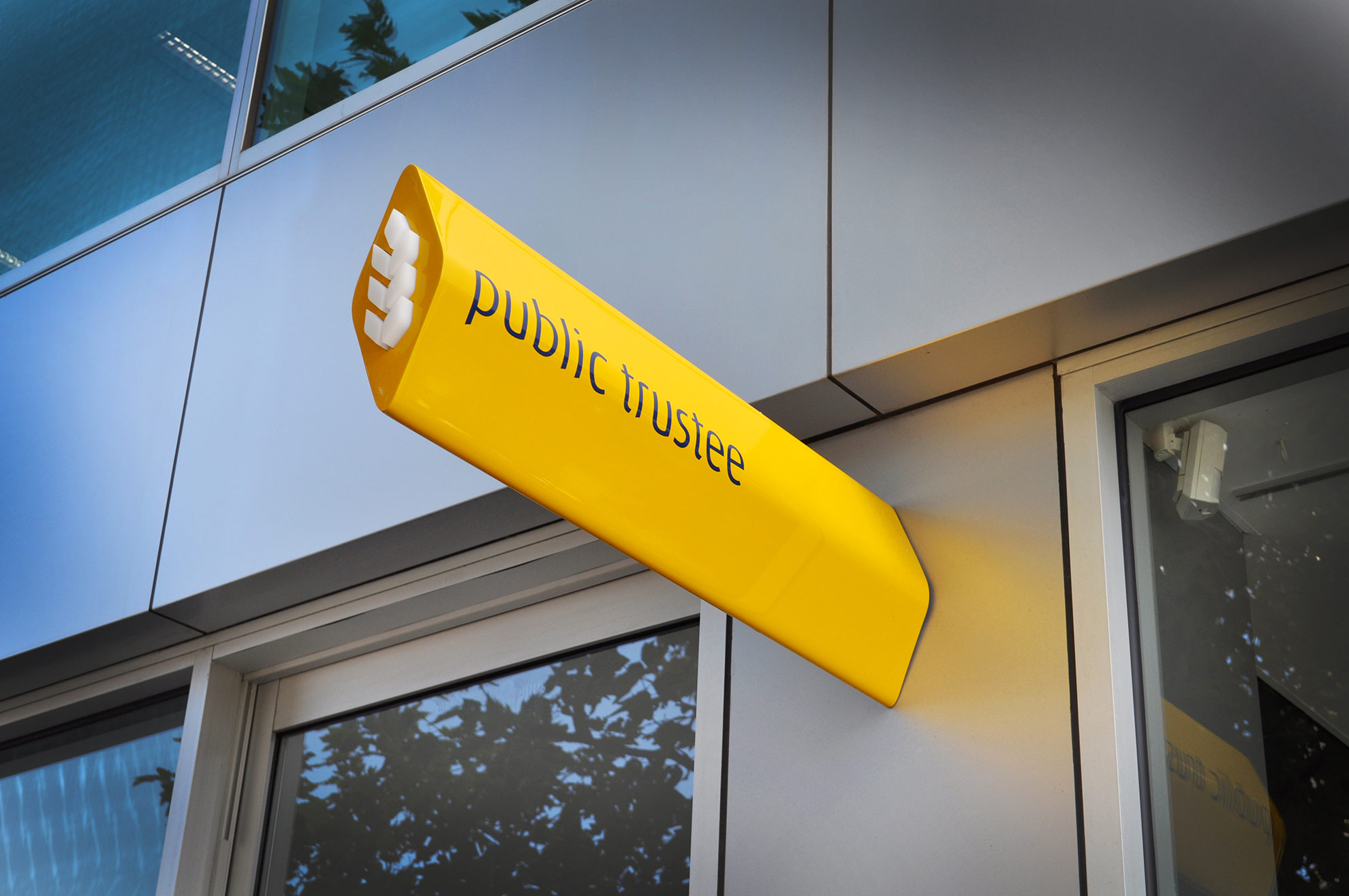
This is a great example of how to deconstruct and transform the vocabulary of a brand by remixing its existing 2d forms in a 3d space. This great blade sign is a molded seamless extrusion based on a piece of the “wheat sheaf logo” for the Australian trustee and executor service company, Public Trustee.