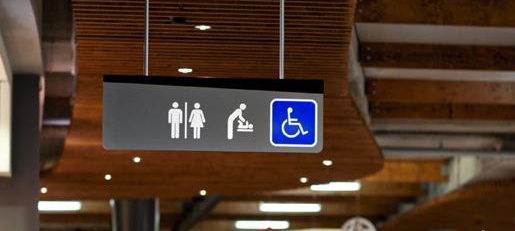
Sleek and angular retail wayfinding for the Highpoint Shopping Centre in Melbourne, Australia by Diadem. The use of a trapezoid face to the signs is carried throughout the system in all of the freestanding signage and along with the strict color palette creates a modern fresh look for the space. In addition, the exposed concrete footer that is worked into the design of the signs is an excellent detail, and an excellent way to use a structural requirement to your advantage instead of hiding it.
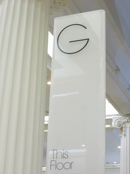
Elegant wayfinding for the British department store Selfridges & Co’s new flagship store by Cartlidge Levene. This sleek white system uses thin silhouettes, rounded corners and gloss finishes to capture the upscale and contemporary feel of this high-end brand.

Playful wayfinding system for a mall rehab in Moscow, Russia by The Bakery. This design responds to the name of the project to “bring a Brasilian forest vibe to the space and make the interior feel friendly and fun.” They do this with a great materials palette of wood and moss as well as a fantastic set of custom stencil typography and icons.
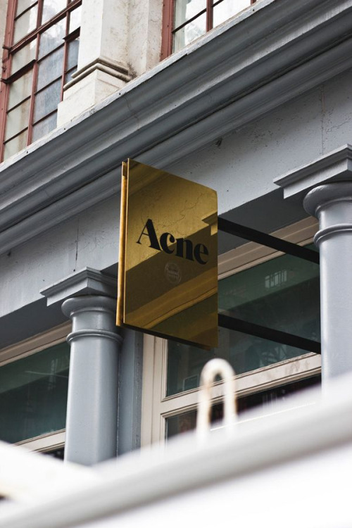
Great use of a mirrored gold finish in this blade sign for the retail brand Acne.
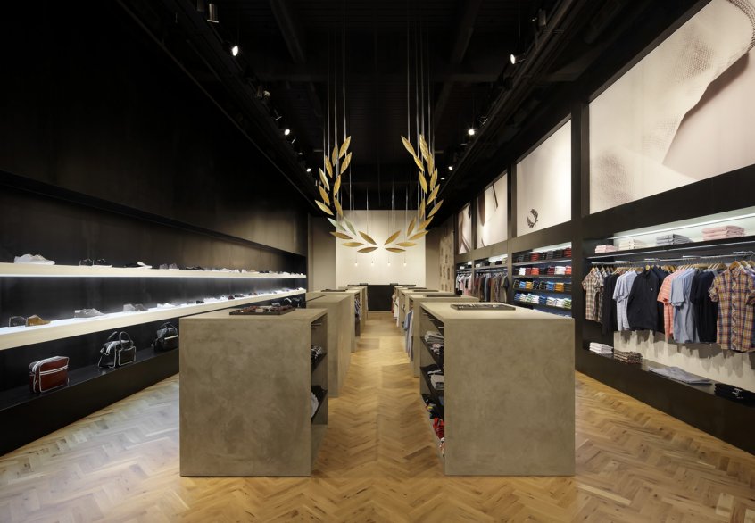
Striking and memorable retail identity for the fashion brand Fred Perry by Buckley Gray Yeoman in London. An inspired use of perspective and sight lines that stays true to the brand while transforming the space into a dynamic customer experience.