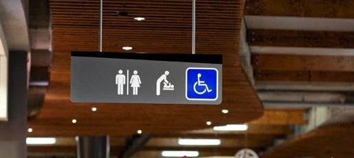
Sleek and angular retail wayfinding for the Highpoint Shopping Centre in Melbourne, Australia by Diadem. The use of a trapezoid face to the signs is carried throughout the system in all of the freestanding signage and along with the strict color palette creates a modern fresh look for the space. In addition, the exposed concrete footer that is worked into the design of the signs is an excellent detail, and an excellent way to use a structural requirement to your advantage instead of hiding it.
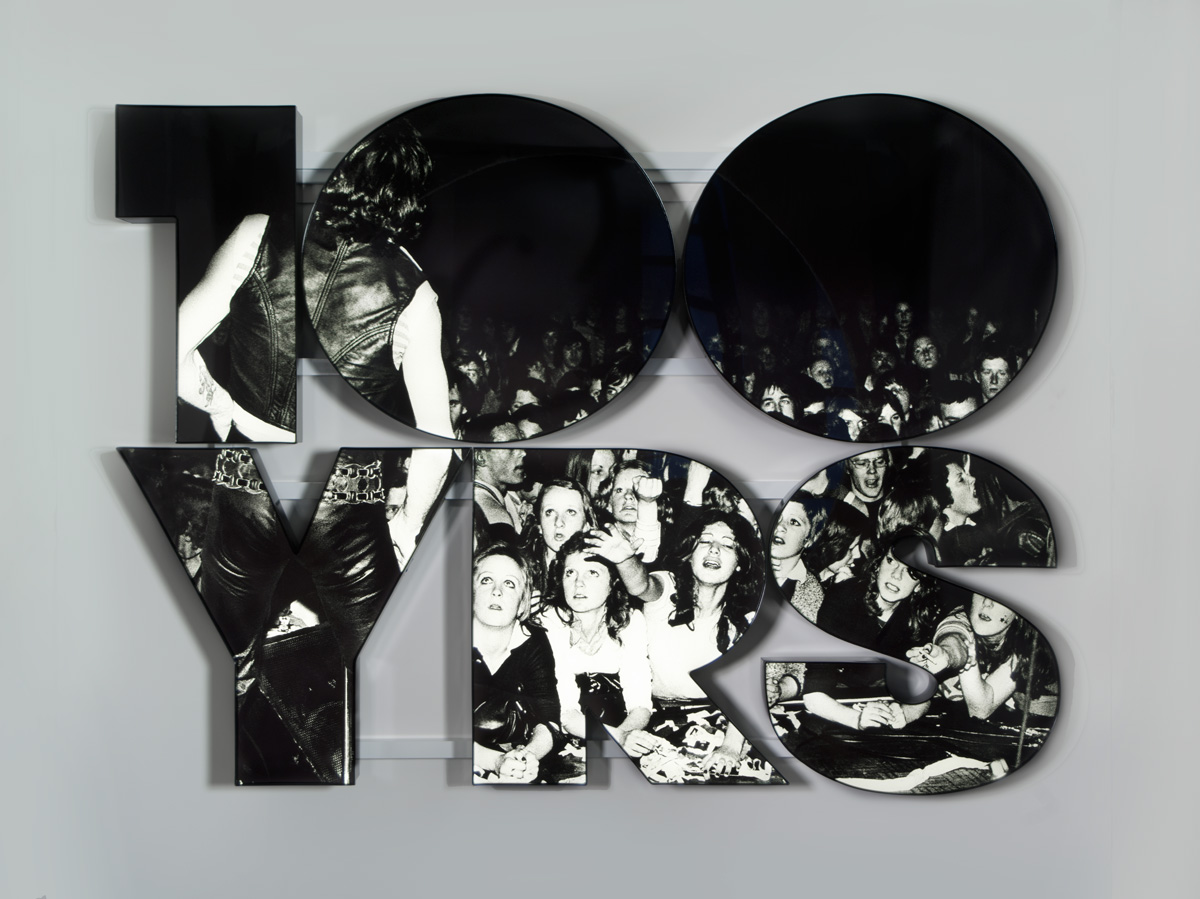
Fantastic typographic art by the Los Angeles and New York based artist Doug Aitken. These works combine sculpture, photography, typography, and diorama in a powerful way that creates memorable and impactful statements and spaces. A great inspiring artist for all Signage and Environmental Graphic Designers.
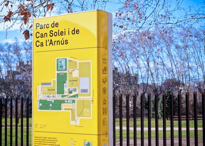
Great Park signage for the Metropolitan Parks of Barcelona by Clase BCN and Salva Fabregas. This iconic yellow system stands out in the green park setting to provide a consistent look for the regions network of urban parks. The design uses a strict formula: “the same material, the same design, the same finish, the same type and the same simple layout” to create a system with an unified modern feel.
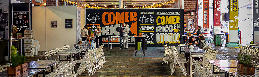
Bright and festive environmental graphics for the Masticar Festival in Buenos Aires—“the most important gastronomic festival of Argentina”. These graphics use hand-lettered type, custom illustrations, and a vibrant color scheme for a look that is both unique and full of life. Its commitment to raw forms and a repetitive poster wallpapering is reminiscent of street event posters and painted window promotions and give the event a bold feeling of excitement.
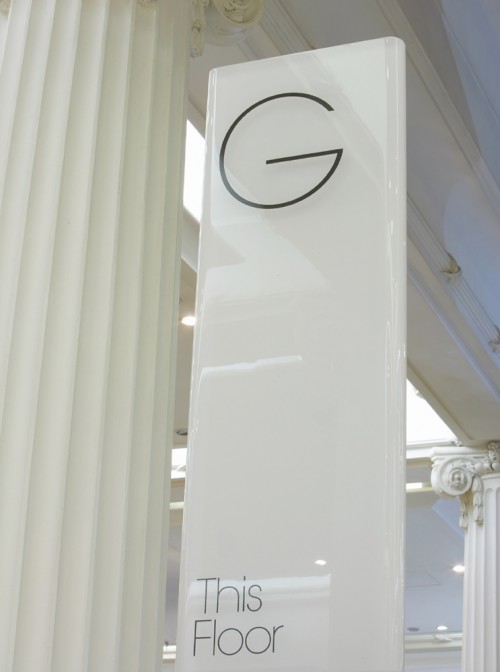
Elegant wayfinding for the British department store Selfridges & Co’s new flagship store by Cartlidge Levene. This sleek white system uses thin silhouettes, rounded corners and gloss finishes to capture the upscale and contemporary feel of this high-end brand.